UX/UI design
NIPTwebsite
NIPT website
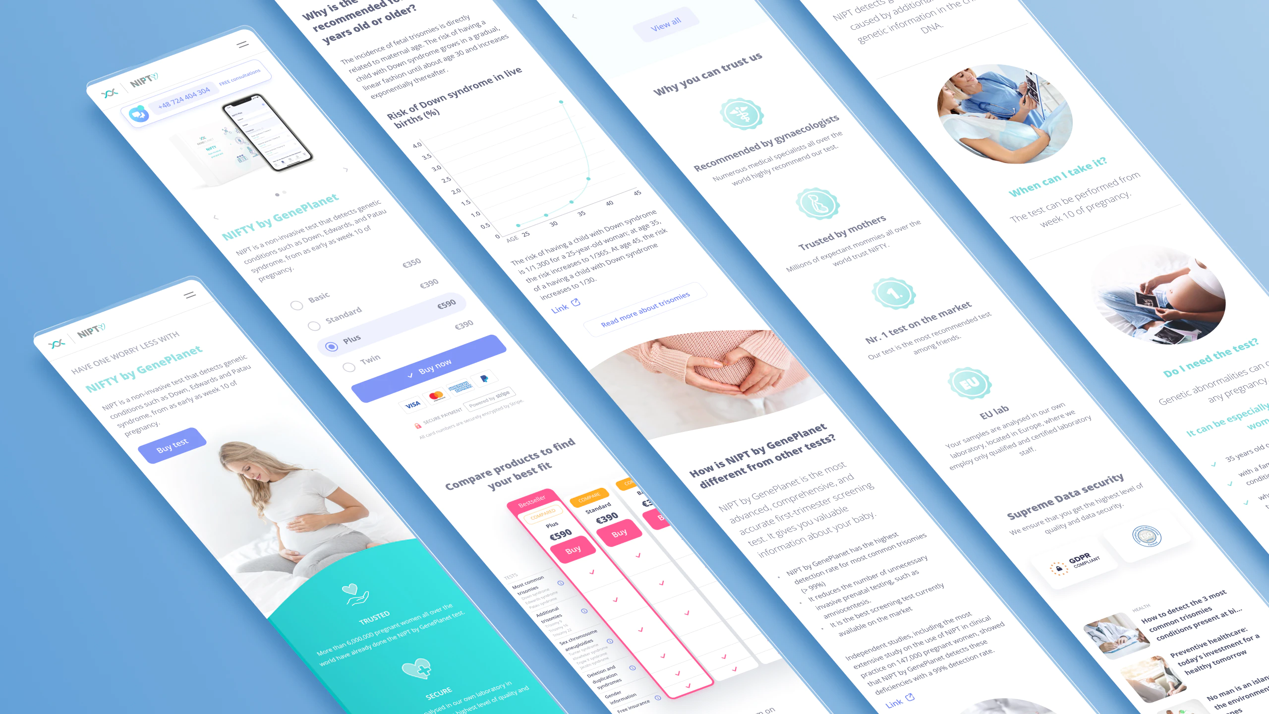
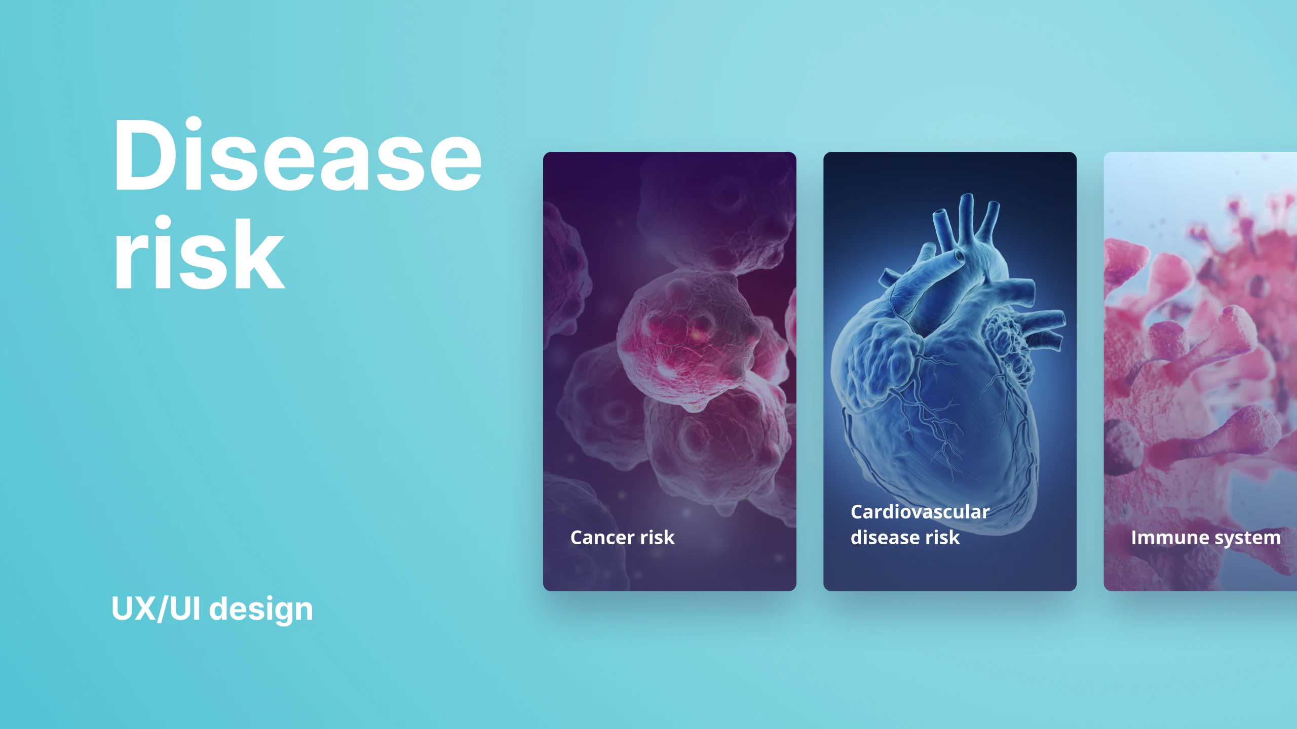
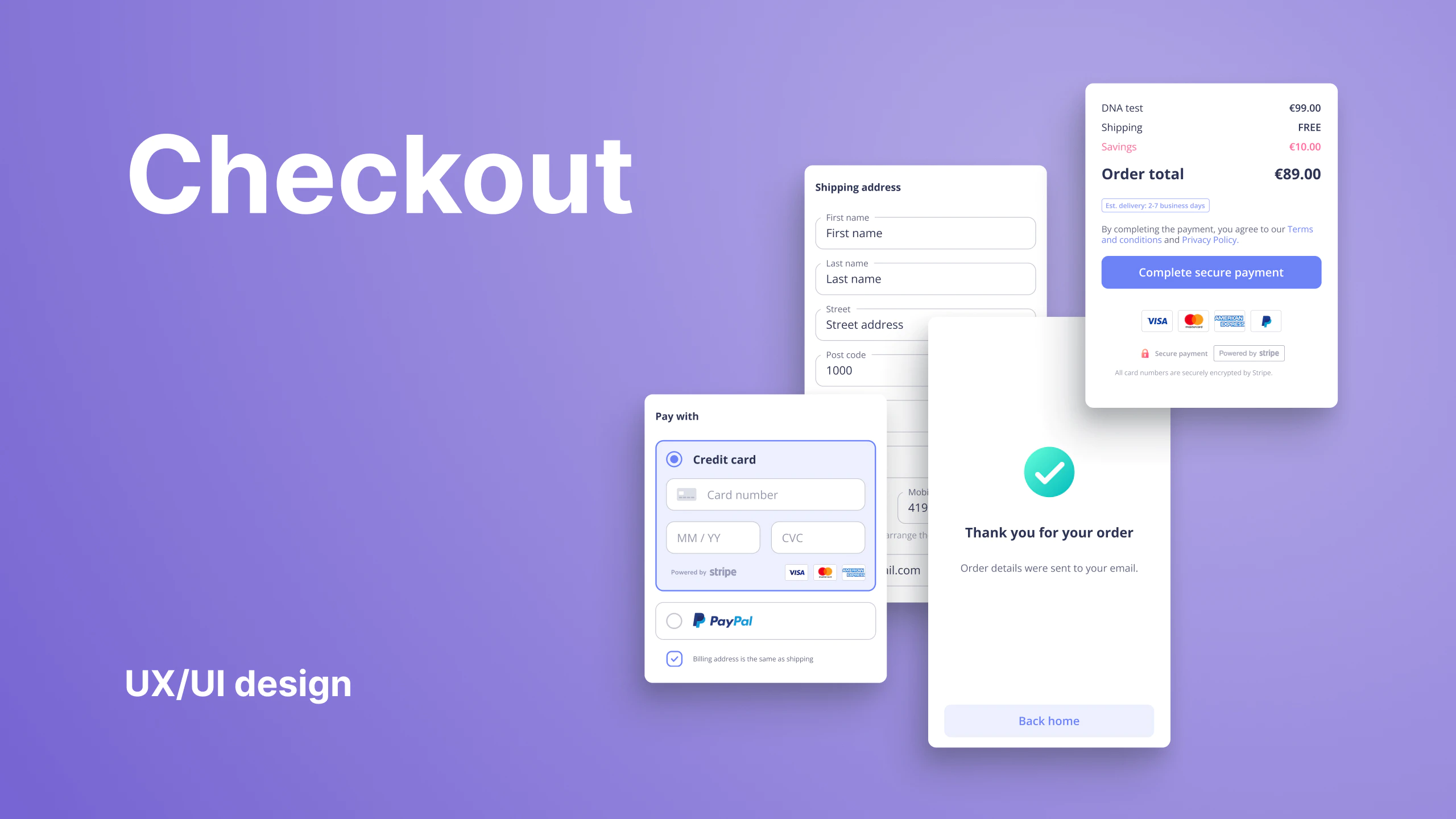
Design user experience and interface for NIPT (Non-invasive prenatal test) website one of the most advanced, comprehensive, and accurate first-trimester screening tests, detecting genetic abnormalities caused by additional or missing genetic information in the child’s DNA. The website introduces the benefits of the test to pregnant women and in some countries offers a checkout.
My responsibility on the project was the direction of user experience and UI design. Working with the brand manager, stakeholders, and designers. Coordinating, mentoring, delegating tasks, and reviewing designers’ work and their contributions to the project. Also responsible for hands-on delivering wireframes, prototypes, creating visual assets, and finalizing the design for handoff.
ClientGeneplanetServicesUX/UI designYear2019Linknipt-geneplanet.com
User story and scenario workshop
A workshop was organized to gain insight what are the user stories and scenarios that the company needs to support with the website. Besides the main audience being pregnant women, we still had to serve as a gynecologist.
Country-specific design
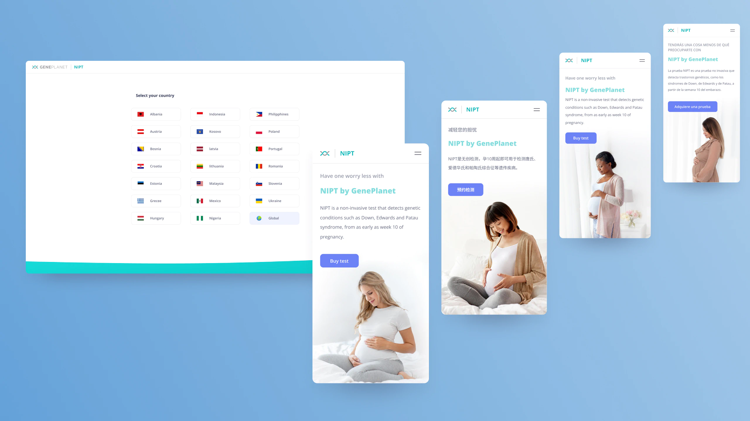
The company and product are already present in many countries. Different markets have their specifics that had to be addressed while aiming at a unified approach. We came up with three main variations of the same design that is suitable for different business models and country-specific customization.
Content organization
We conducted user interviews to prioritize the information in the content brief and further inform our decisions.
Outlining content brief with the wireframes
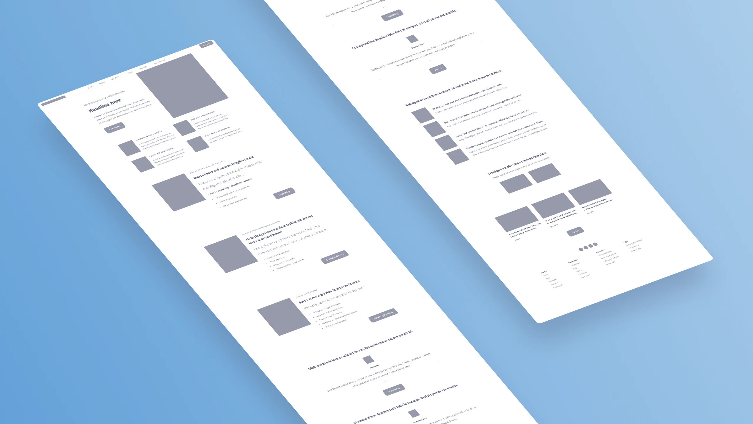
Based on the user scenarios and prioritized marketing content we worked with wireframes to define the best content layout options.
User flows for different scenarios
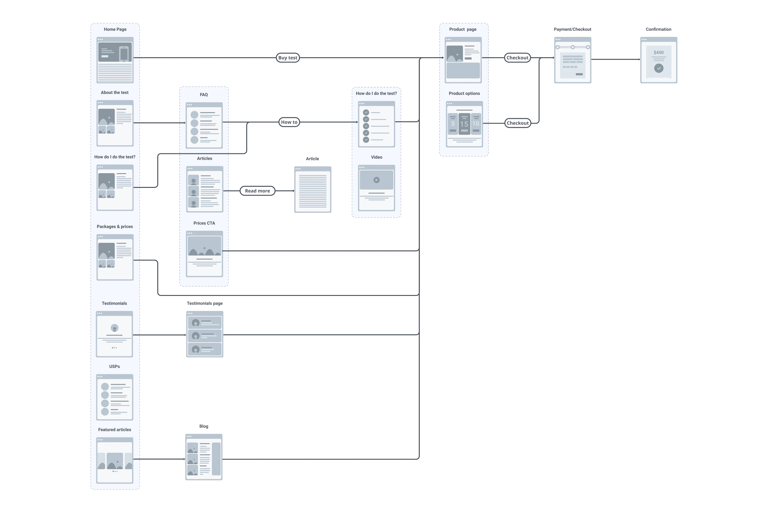
The important part for envisioning the user interacting with the content for different scenarios was user flows.
Mobile-first
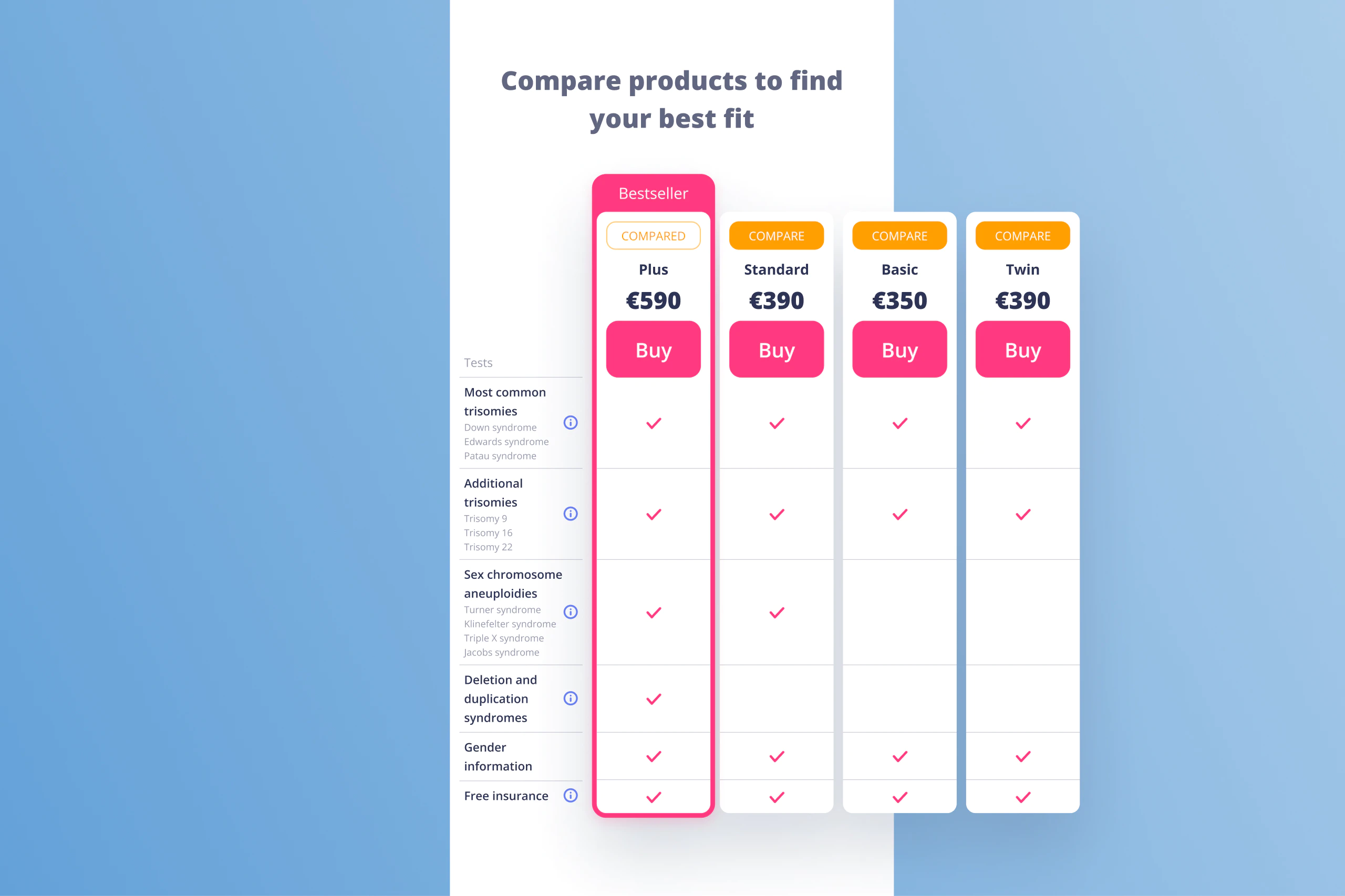
We approached the project mobile-first as a lot of the traffic was anticipated to come from social media campaigns. We put great emphasis on the UI patterns. For example, we developed a custom product options table with a product comparison feature, this way we improved user experience and ease of comparing the products which were noticed problematic during prototype user tests.
User interface design
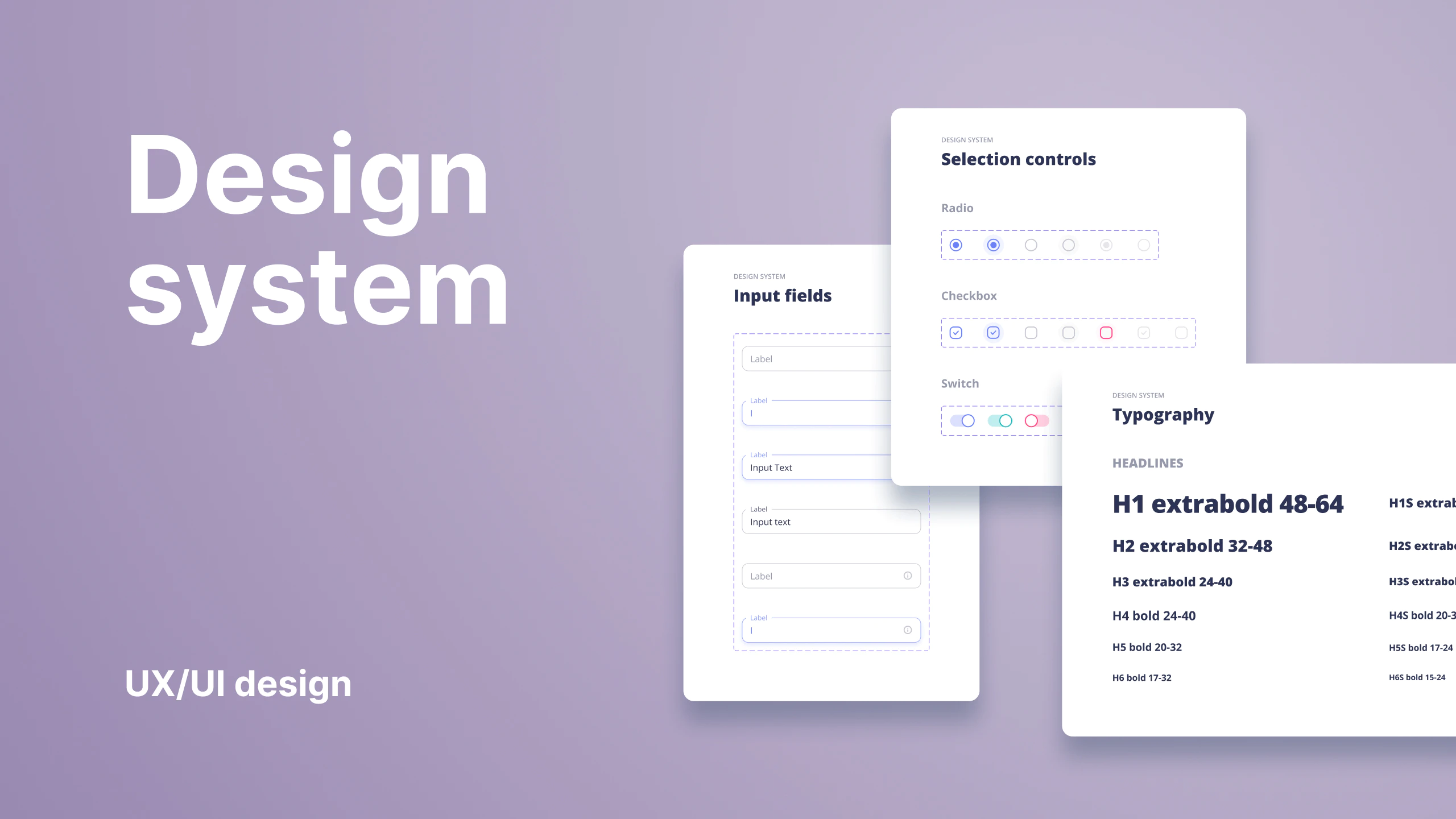
Creating mood boards with the marketing team helped us to understand the possibilities and direction. By reviewing examples we communicated pro and contra arguments with actual context. This way we further defined the direction of the website design. We focused on creating a minimalistic, trustworthy, and modern style.

