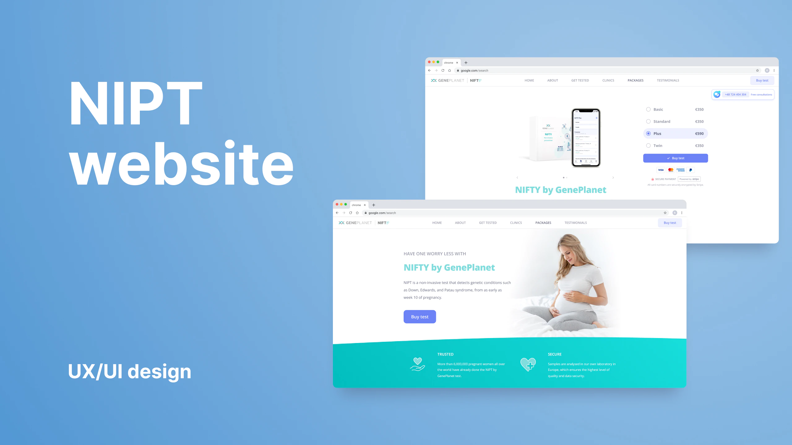
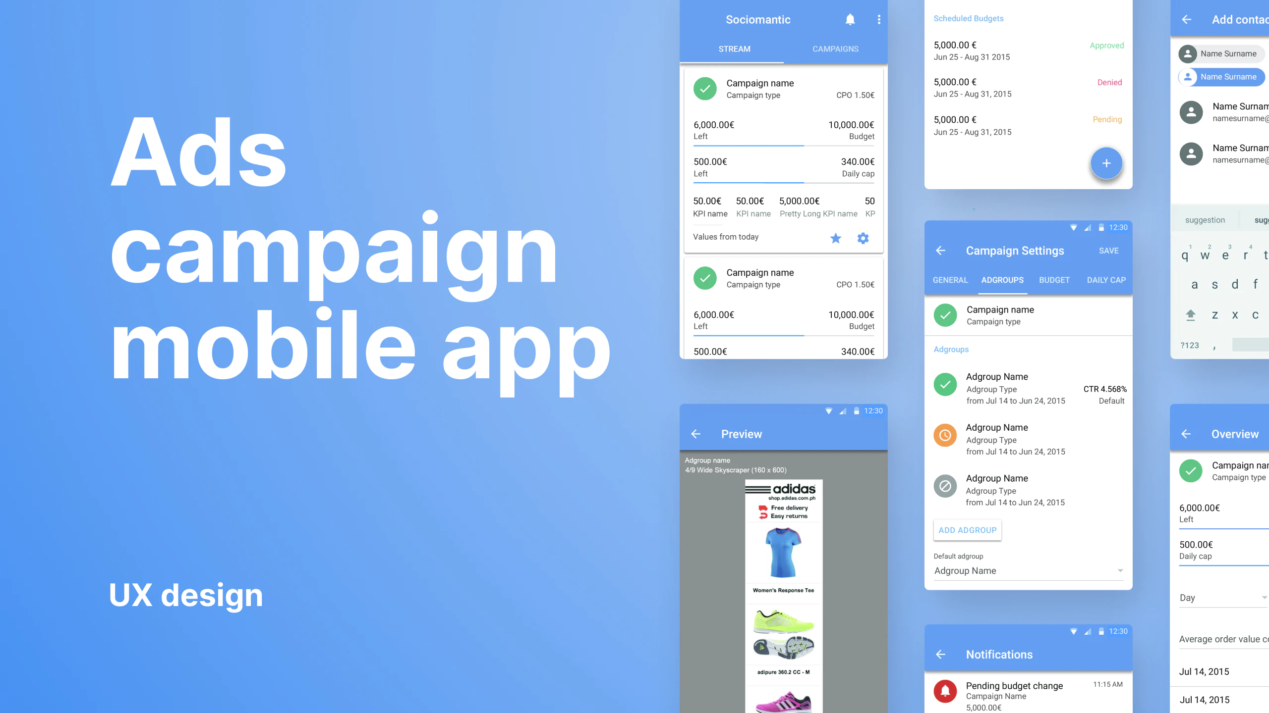
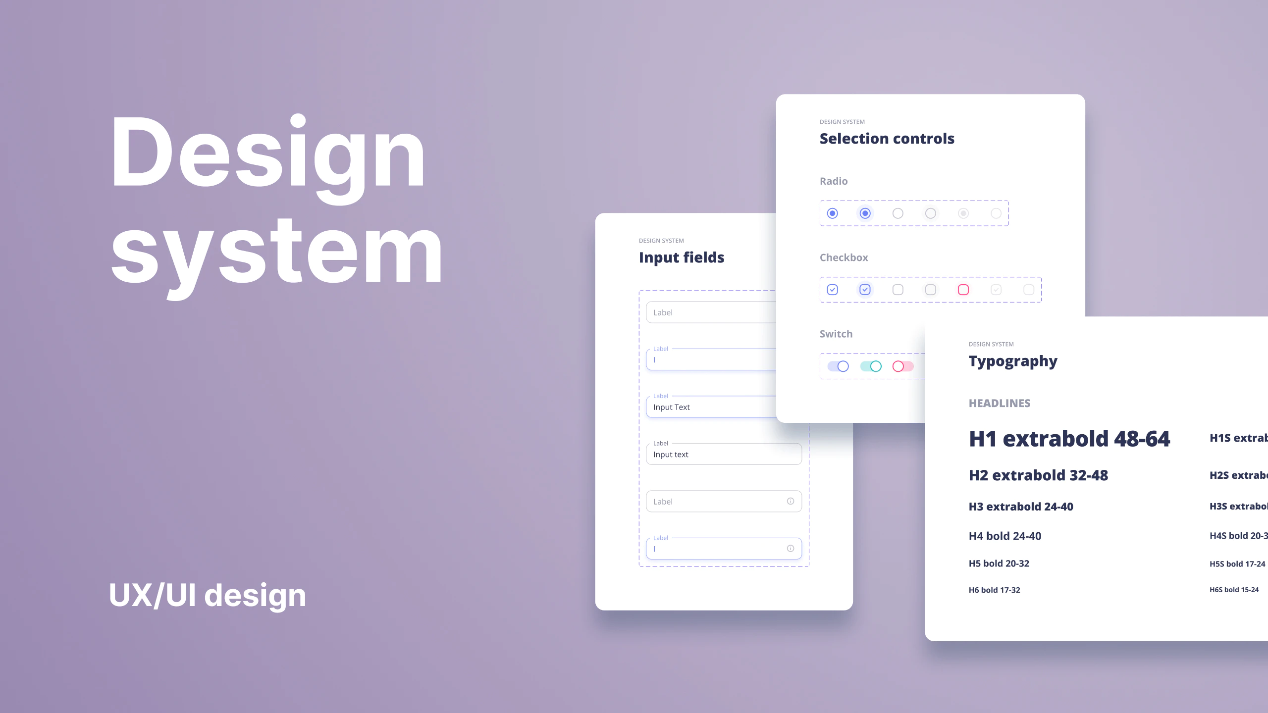
UX/UI design
Geneplanetcheckout
Geneplanet checkout
Based on analytics data insight a significant dropoff was detected at the checkout. Further testing and investigation narrowed possible causes to the use of three-step checkout and some other underserved aspects of the checkout process and interface.
My responsibility on the project was the direction of user experience and UI design. Working with project managers, stakeholders, and designers. Coordinating, mentoring, delegating tasks, and reviewing designers’ work and their contributions to the project. Also responsible for hands-on delivering wireframes, prototypes, creating visual assets, and finalizing the design for handoff.
ClientGeneplanetServicesUX/UI designYear2021Linkgeneplanet.com
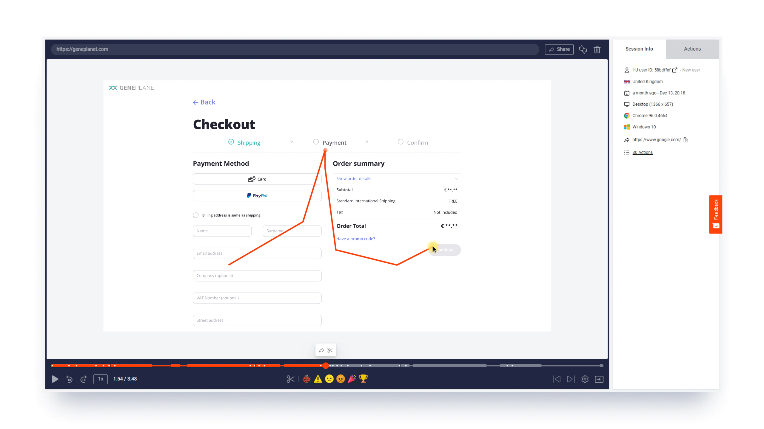
Analyze the checkout recordings
First, we had to understand how users behave during the checkout. Our research team analyzed the checkout process recordings to discover patterns and gather insights into what is causing the low completion rate.
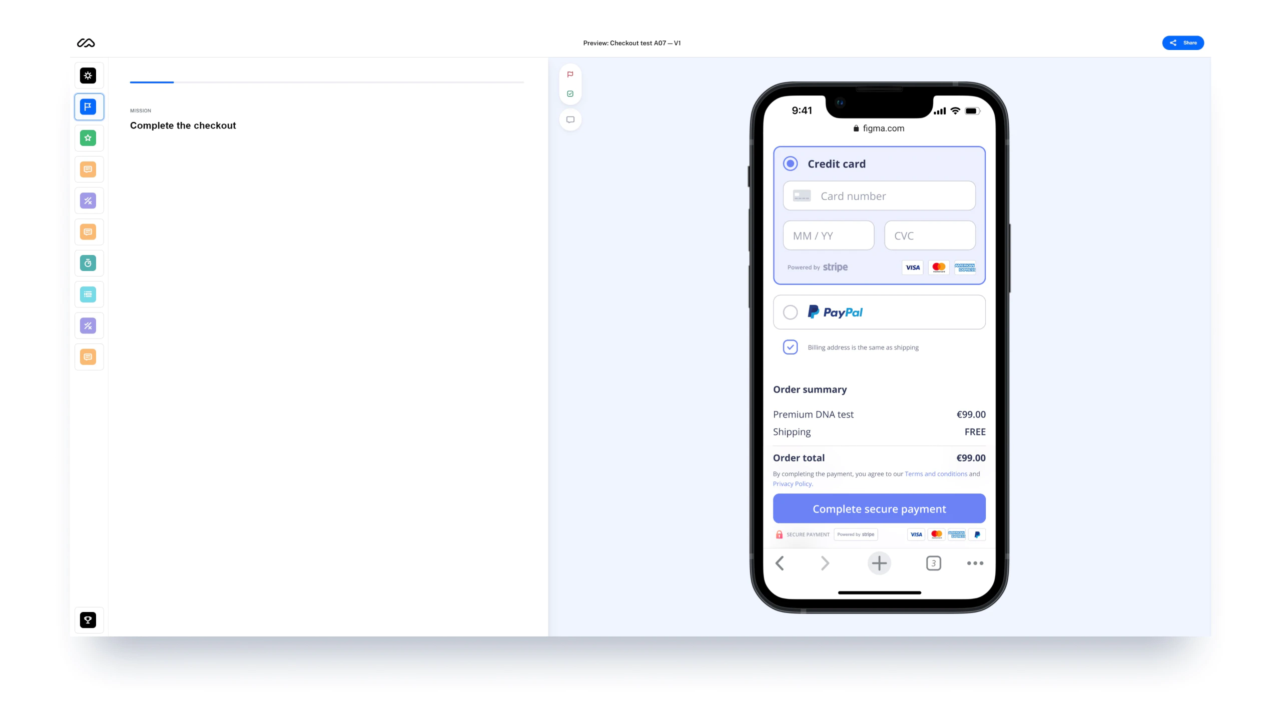
Designing and testing the improvements
Insights were solid evidence and served as a starting point for design improvement suggestions. We iterated on different potential improvement ideas by conducting quantitative and qualitative user tests.
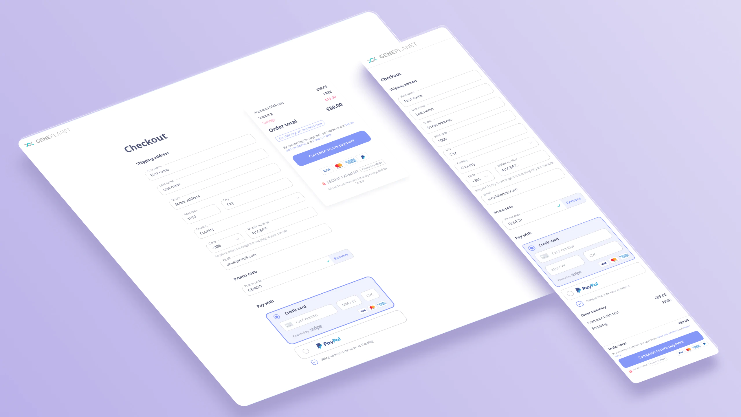
Checkout solution
We implemented numerous improvements to the existing checkout. In short, we figured one-step checkout had a normal dropoff rate and thus modified the design to facilitate it. Besides this fundamental change, other interventions like improved payment method selection, added validations, descriptions, auto-fills, and others were made.
