UX/UI design
Bloodresults
Blood results
Blood work results help users understand blood test results by fetching and converting laboratory reports into clear interpretation and explanation of each marker result, and concrete recommendations. Based on blood marker results, the user receives actionable advice in the form of recommendations to begin implementing immediately. The feature was planned as a part of the health platform.
My responsibility on the project was the direction of user experience and UI design. Working with the product manager, stakeholders, and designers. Coordinating, mentoring, delegating tasks, and reviewing designers’ work and their contributions to the project. Also responsible for hands-on delivering wireframes, prototypes creating visual assets, and finalizing the design for handoff.
ClientGeneplanet ServicesUX/UI designYear2022Linkapp.geneplanet.com
User interviews
User interviews gave us insights into opportunities to improve current lab reports. Users are relatively familiar with blood work tests, thus they expressed numerous pain points.
Wireframes and user tests
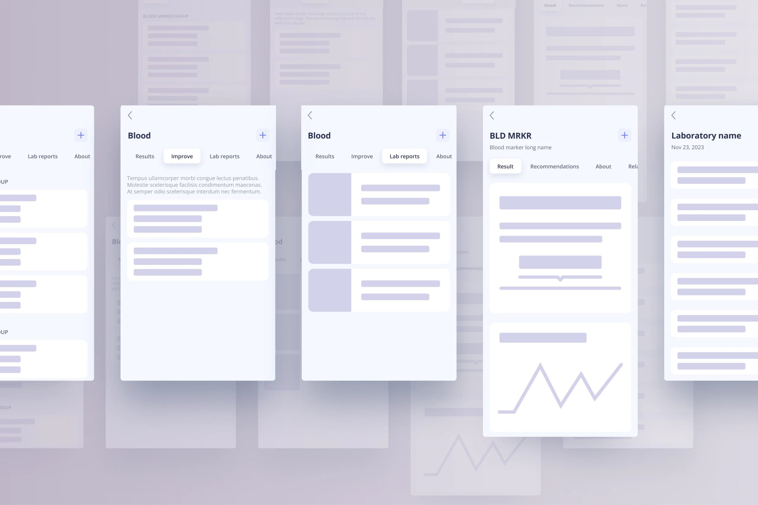
Based on the opportunities discovered with interviews we sketched and tested the wireframes to refine the concept.
Designing the feature
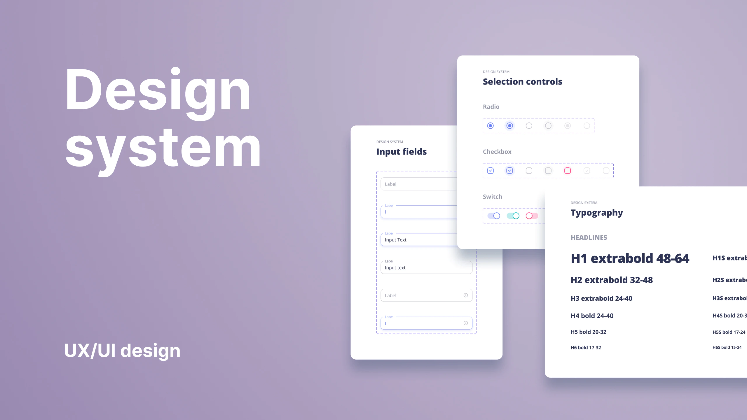
Designing the user interface was straightforward due to the flexible design system and established basic user interface patterns and layouts.
Connecting with labs
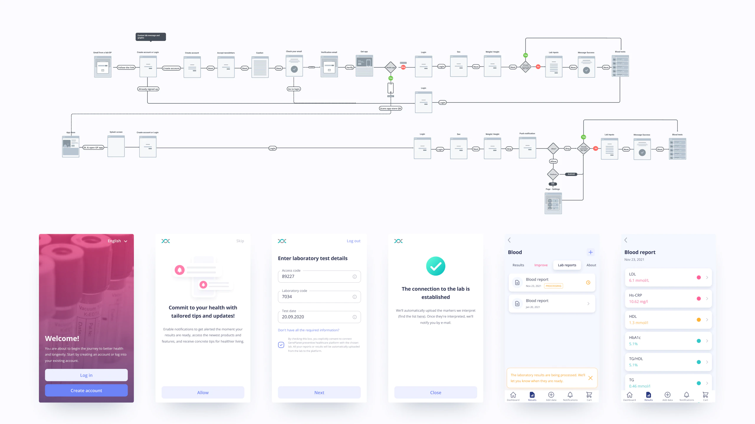
The user flow for connecting labs to the platform was planned with flowcharts and tested with the users for a frictionless process. The process is simple. The customer receives the email with a link to the onboarding flow where they either log in or register and input the unique code received in the lab, date, and lab identification code. Each laboratory users need to connect just once. Results for the future bloodwork in the laboratories will be automatically fetched, meaning that the link would take users directly to the lab report. If the results are not fetched yet or not available a lab report pending status is shown.
The color-coded results
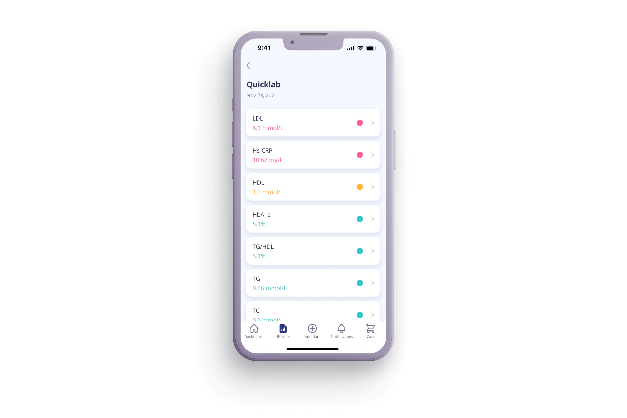
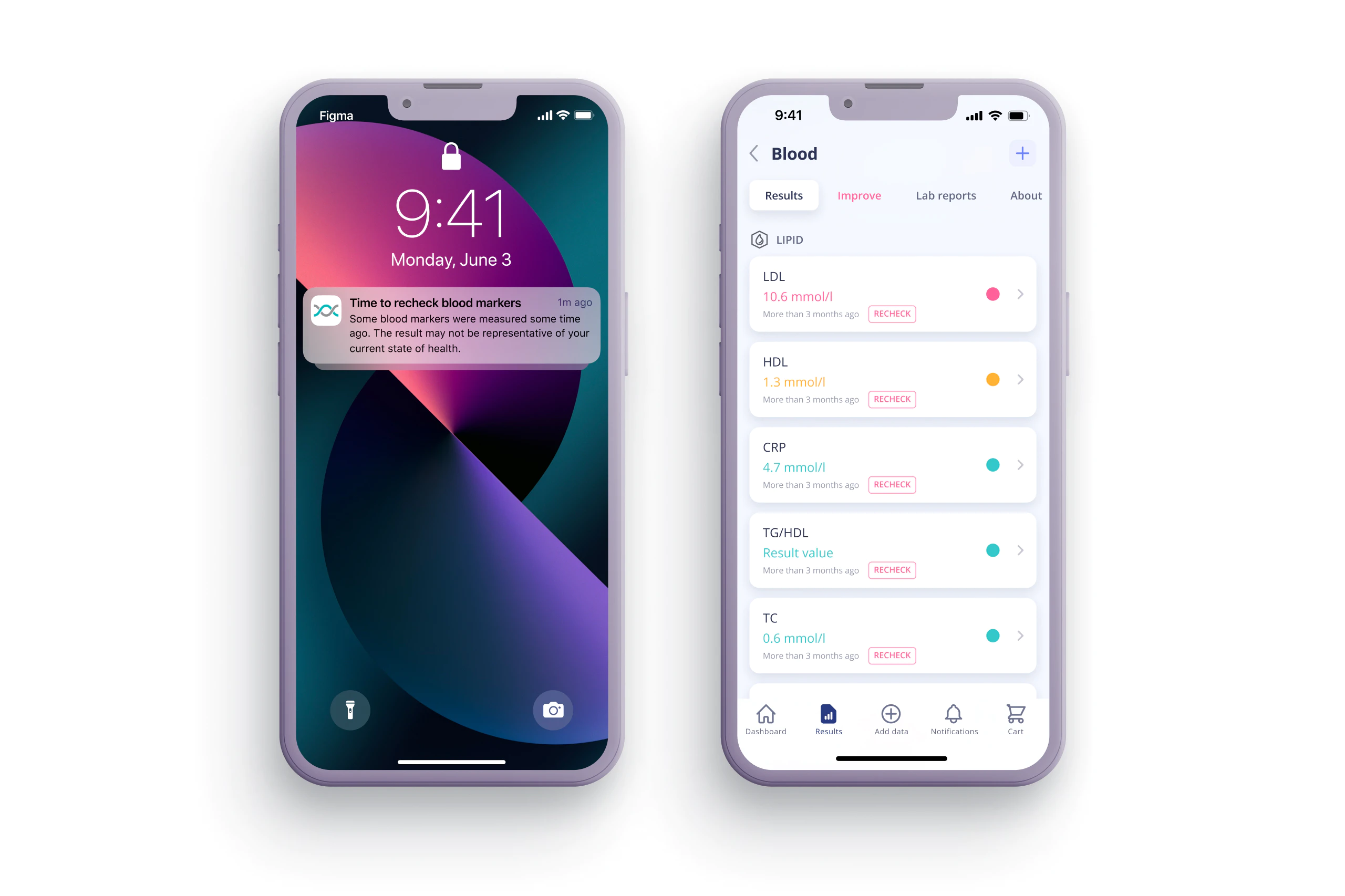
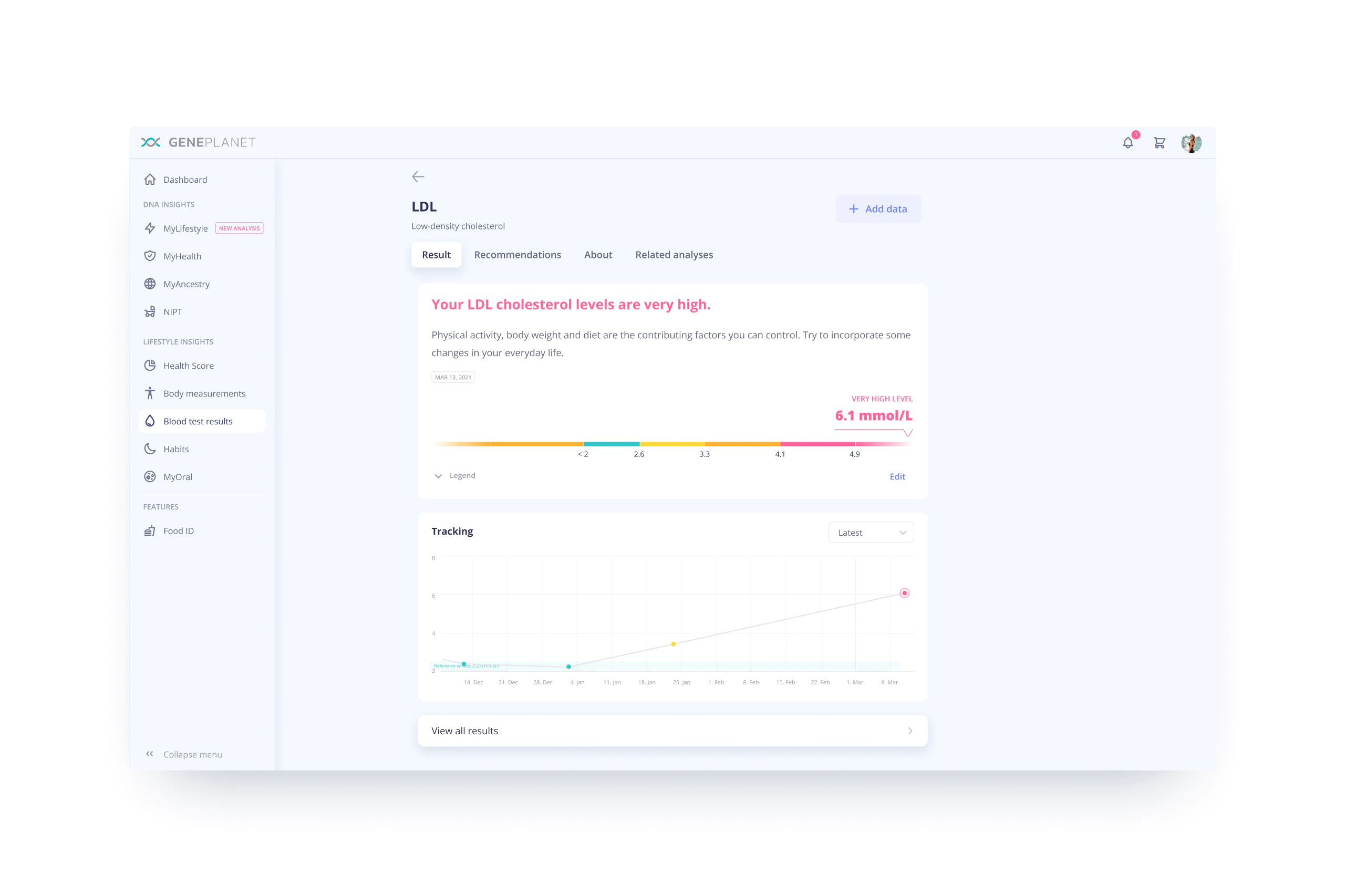
The problem with regular bloodwork reports is that there are usually just bolded values and L or H abbreviations to highlight the blood markers out of a normal range. To improve this we created a color-coded result mapping system where not only optimal and non-optimal markers are mapped but also other result ranges for precise result interpretation. The traffic light analogy was well accepted by users and gave a sense of the results at a glance.
Highlighted critical results
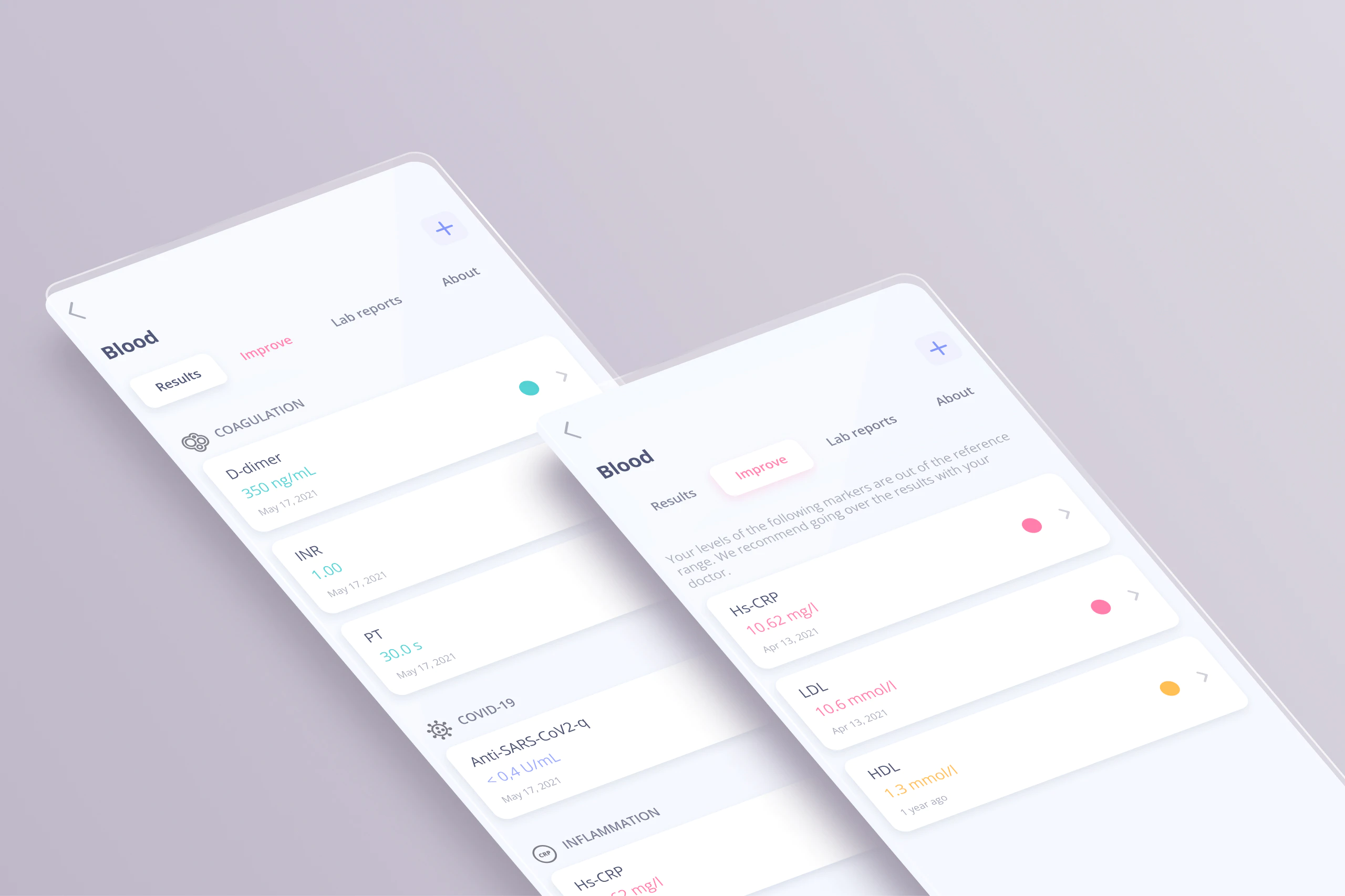
Because there are numerous blood markers we had to group them into panels to make the general blood marker result list readable. This could eventually render a critical result to be listed below the fold and not visible to a user. Therefore we created a filtered list of critical blood marker results under a separate tab. This way users can access these analyses and the recommendations on how to improve the results.
Recheck notifications
For the critical blood marker results, it is important to do re-checks and monitor them. We implemented the re-check notification and labeling system for these markers
Results’ trend grap
By recording multiple results users can monitor the trend and view results from the history log. This was recognized as a valuable feature to the users and solved the pain of saving the physical report or even remembering the previous result, especially for not critical results.
Interpretation of results
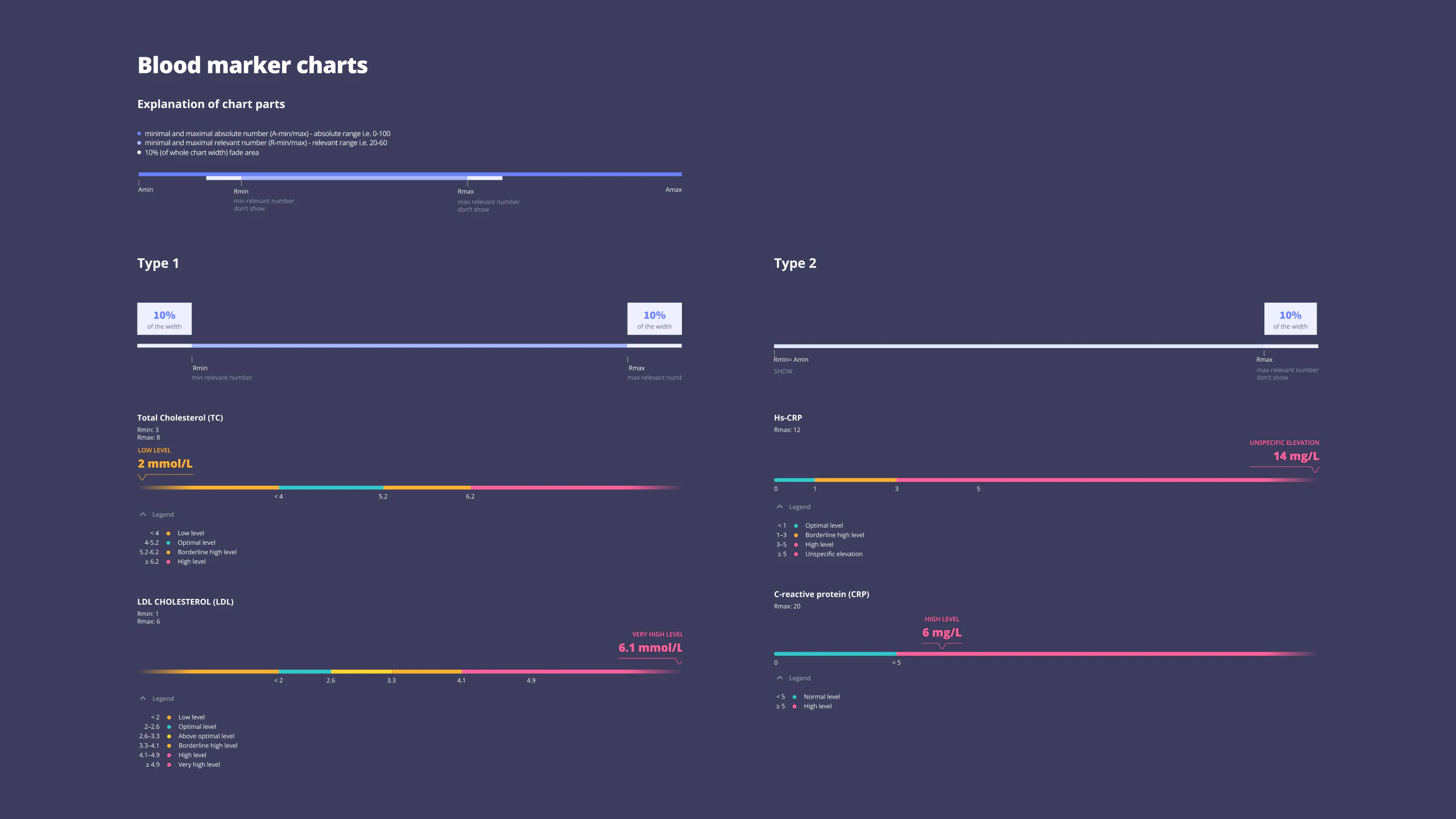
For the comprehensive result interpretation, we figured that users want to understand how far from optimal or non-optimal their result is. We created a system of blood marker result visualization with a proportional scale, focused on the range of values that accrue in 95% of the population. This approach enabled us to show values on a proportional scale and for most of the results avoid displaying irrelevant parts of the absolute range. CPR blood marker for example has an absolute value range between 0 and 400, but the majority of the results happen between 0 and 20, which we named as the relevant range
Manually add the results
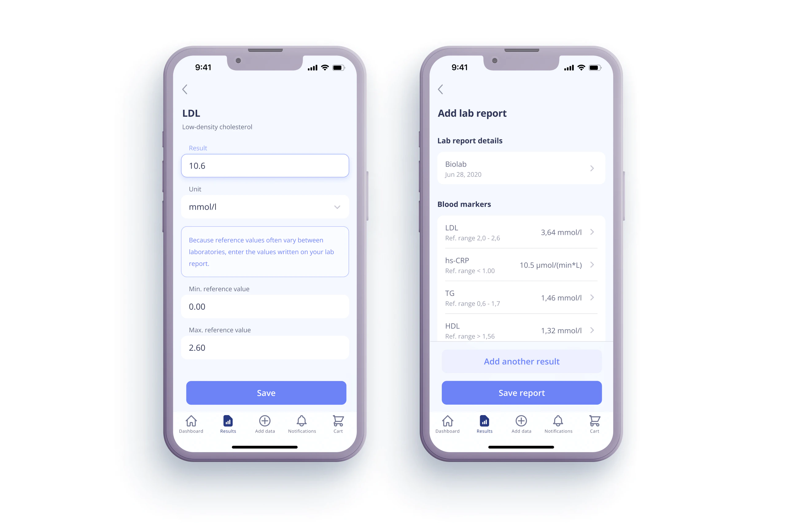
While syncing the results automatically to the platform is the easiest way to get the results, interpretation, and recommendations, the company wanted to offer users to add their results also manually. For this use case, we discovered the need to service two scenarios. One where the user adds a single blood marker or multiple markers and saves it as a report.


