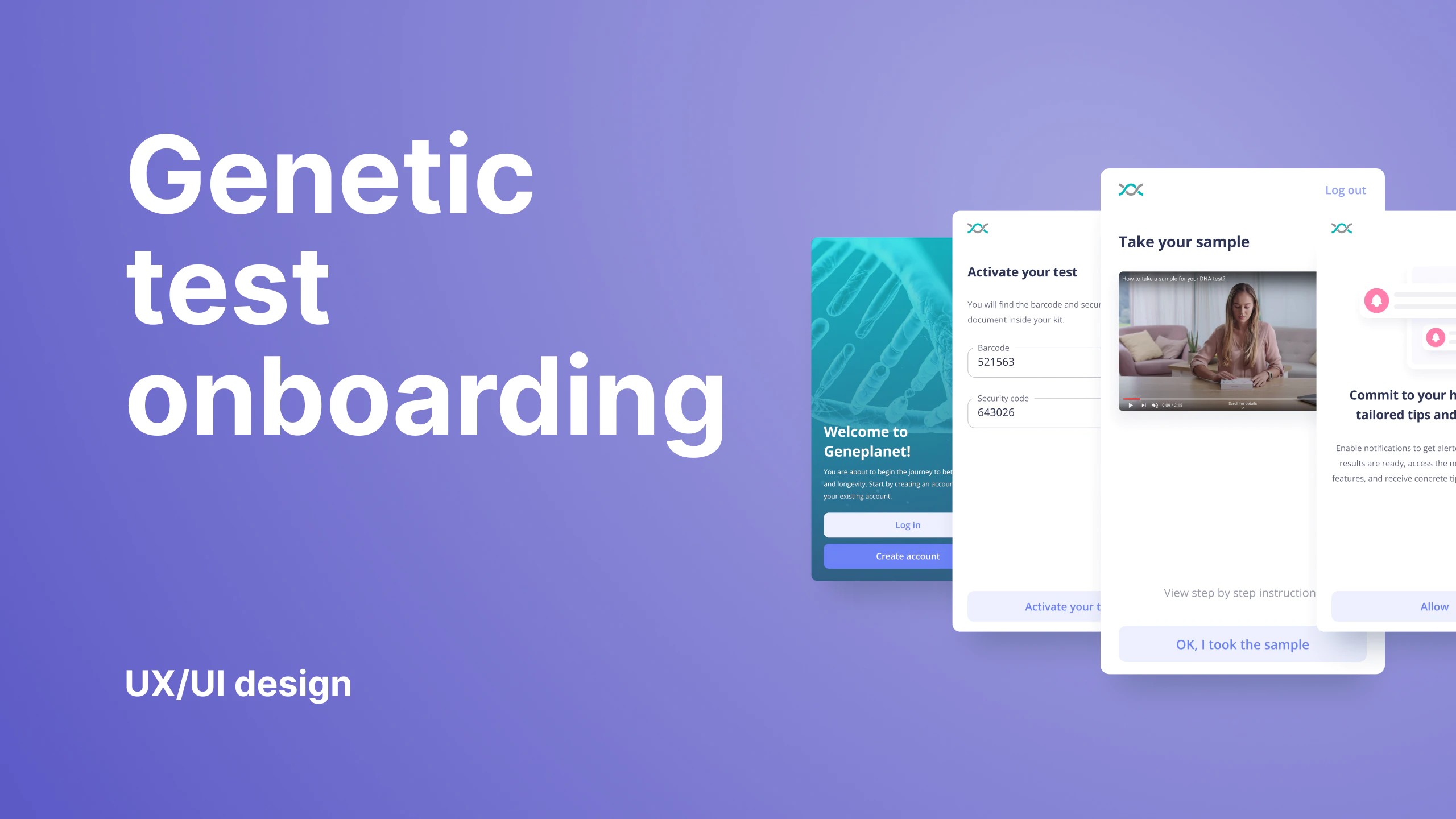
UX/UI design
Healthintelligenceapp
Health intelligence app
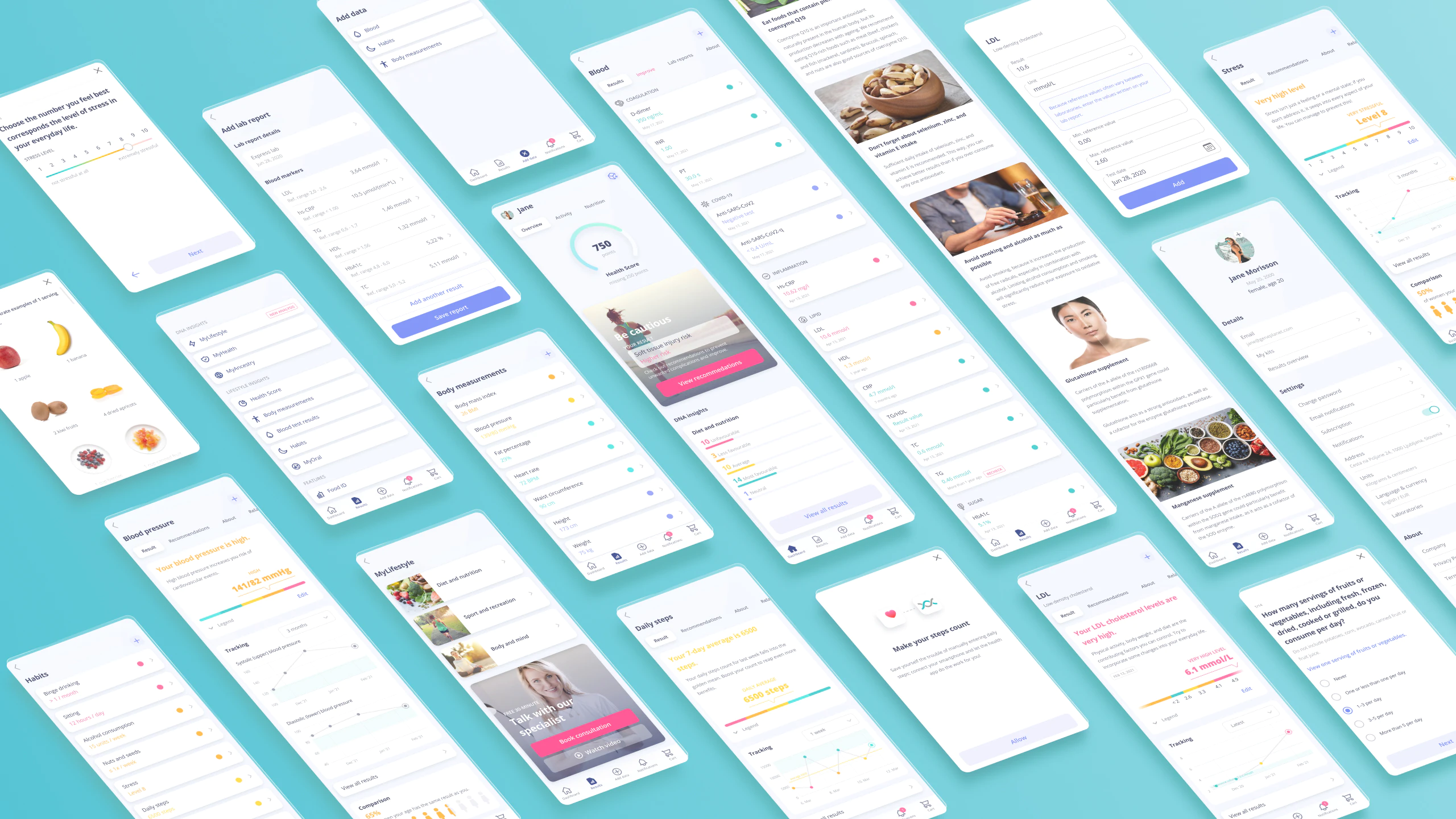
Design the dashboard for GenePlanet’s Health Intelligence platform that integrates biological data (DNA and blood test results) with information about customers’ habits and body measurements. Based on this input, it creates personalized recommendations regarding nutrition, physical exercise, and stress management.
My responsibility on the project was the direction of user experience and UI design. Working with product managers, developers, other stakeholders, and designers. Coordinating, mentoring, delegating tasks, and reviewing designers’ work and their contributions to the project. Also responsible for hands-on delivering wireframes, prototypes, creating visual assets, and finalizing the design for handoff.
ClientGeneplanet ServicesUX/UI designYear2019–2022Linkapp.geneplanet.com
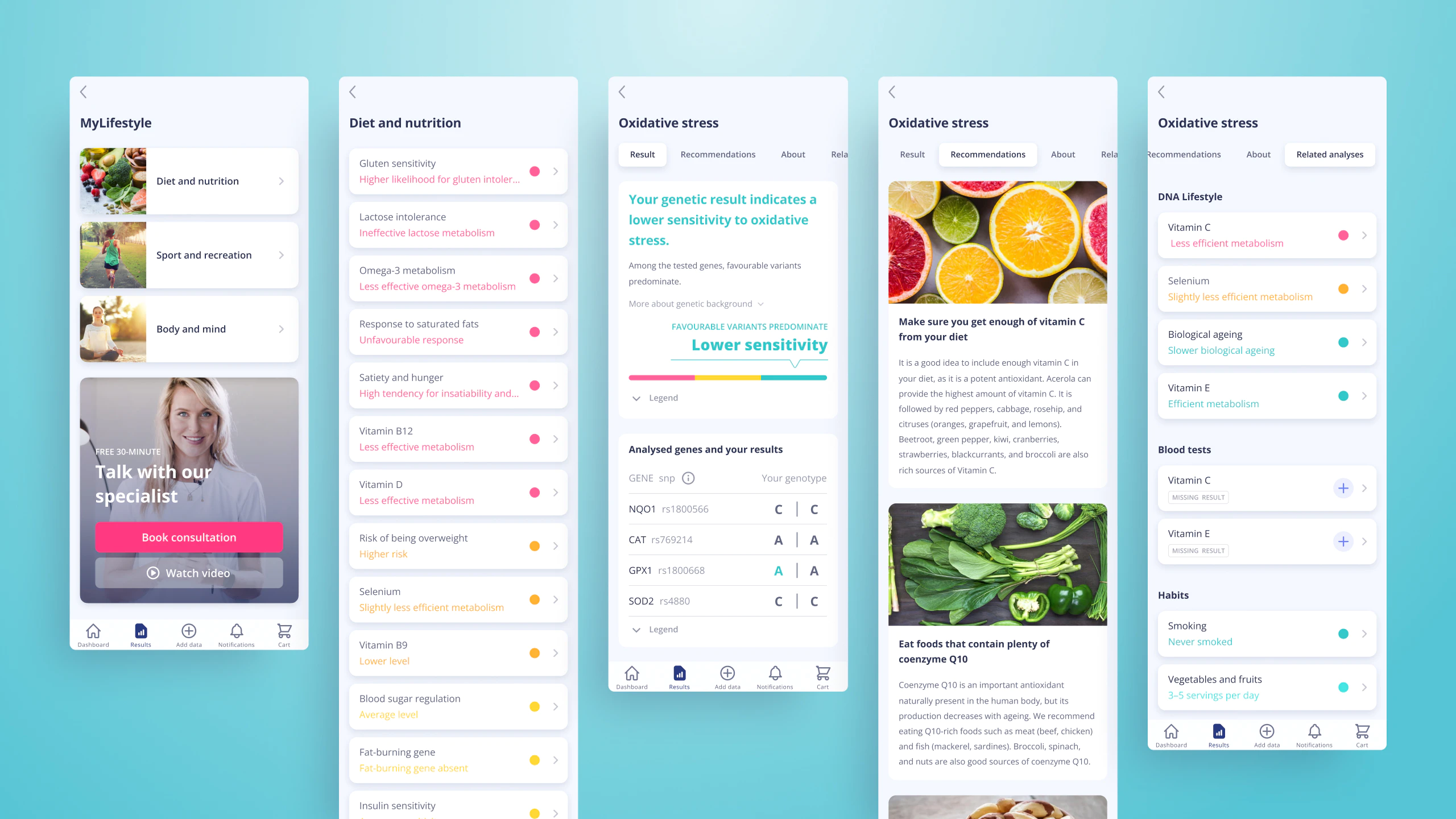
Digitalization of the DNA reports and more
The company had used printed personalized books with DNA test reports and decided to create a digital health platform. Besides the lifestyle DNA reports the platform was planned to include blood, body measurements, habits, and many more types of reports in one place.
Brief and defining user stories
The project brief was elaborate and contained many business requirements and constraints. The design team enforced the importance of user needs by defining and prioritizing user stories.
High-fidelity wireframes
With user stories prioritized and their respective content or features, we designed initial wireframes. The wireframes were proof-tested on users and presented for the stakeholders’ feedback.
User testing the designs
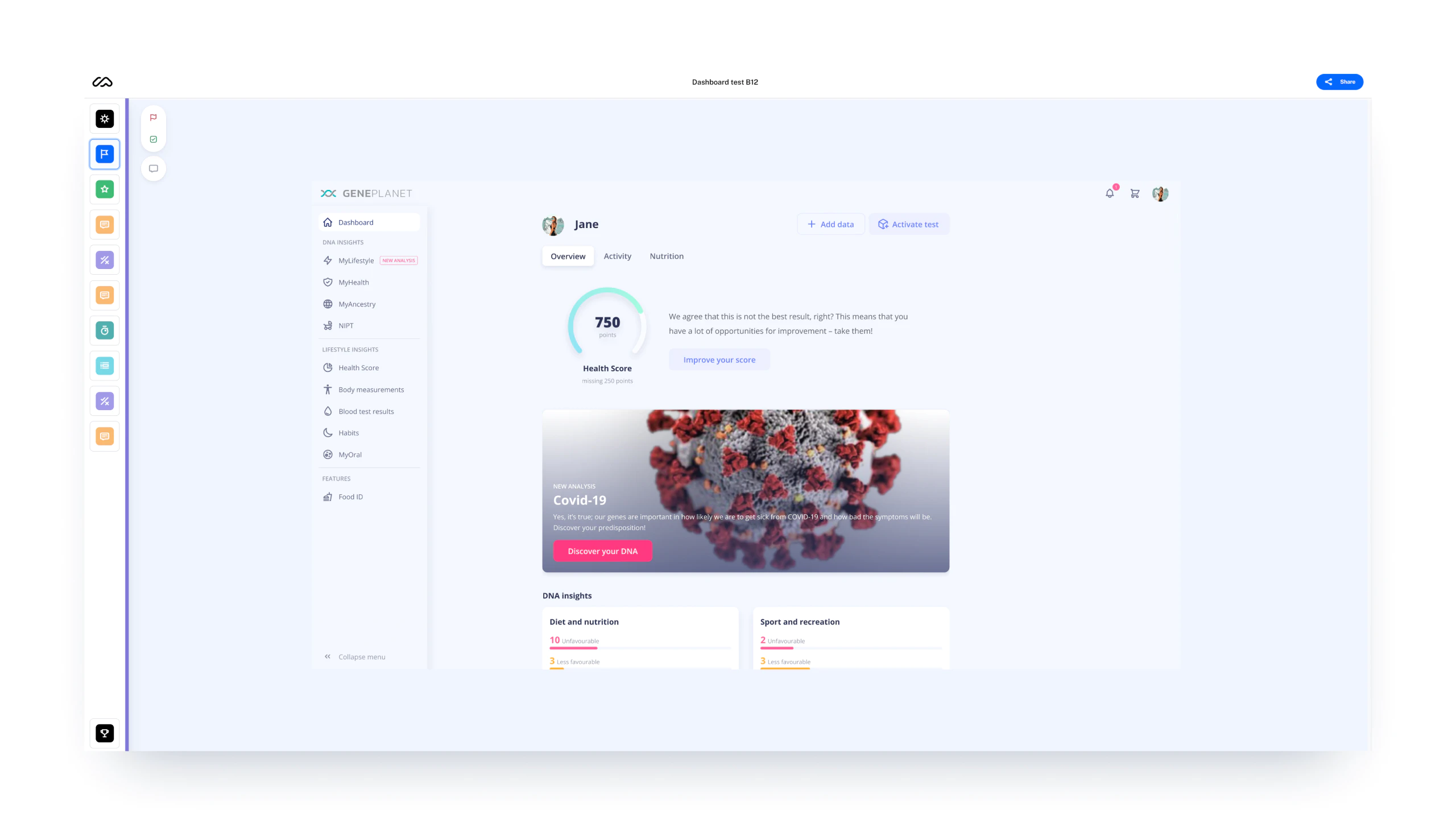
We conducted various user tests in Maze to gain knowledge and refine the designs.
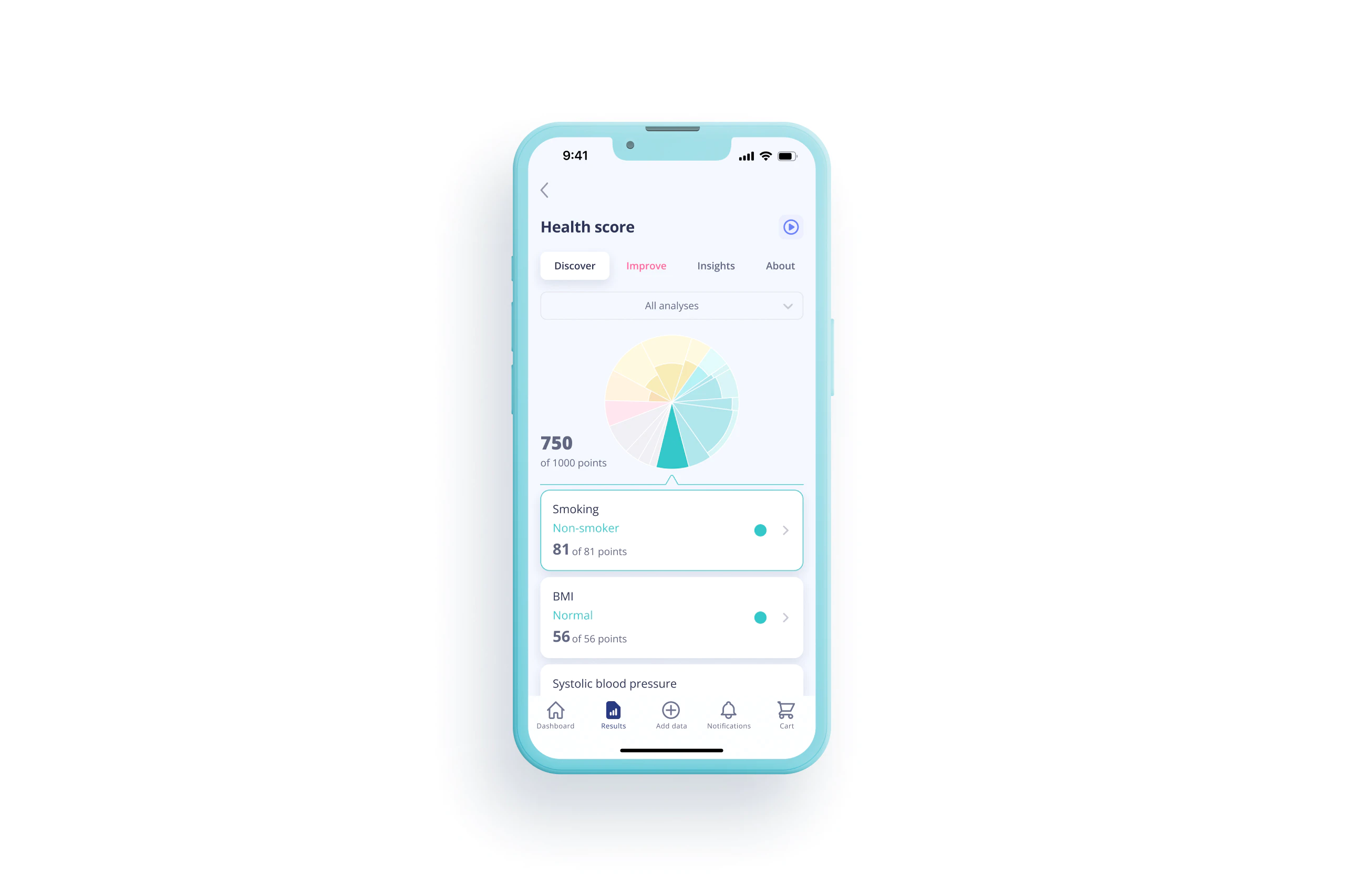
Health score feature
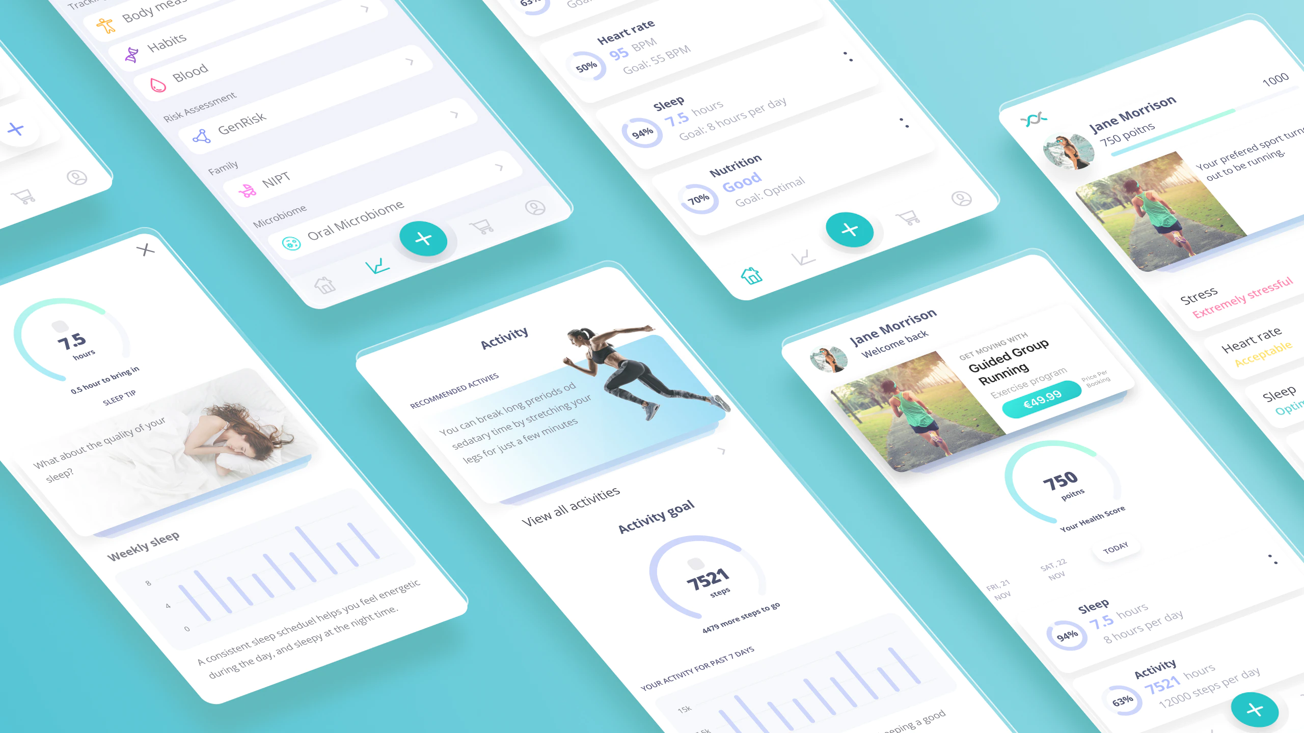
The feature represents users’ health scores which combine data from various results and habits. The score is frequently updated based on the changing input data. It also gives a user a whole brief evaluation of their current health status.
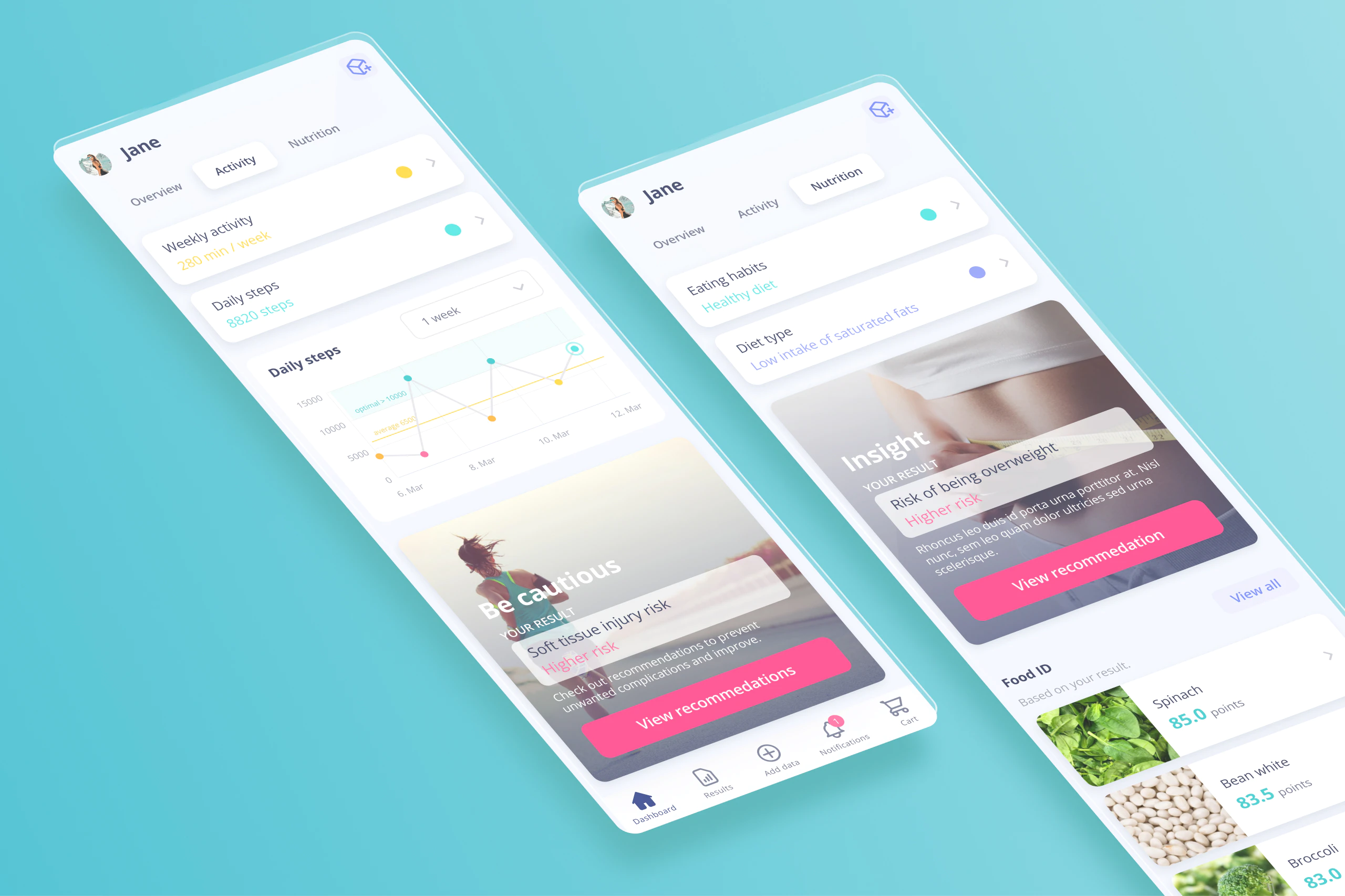
Activity and nutrition tabs
Researching the best way to organize the information we figured that there are three main pillars to improve one’s health: activity, nutrition, and recovery. Based on this we planned tabs intended for the thematic content. The tabs present information excerpts and links to details. The recovery tab is missing because there were no resources to deliver relevant content for it.
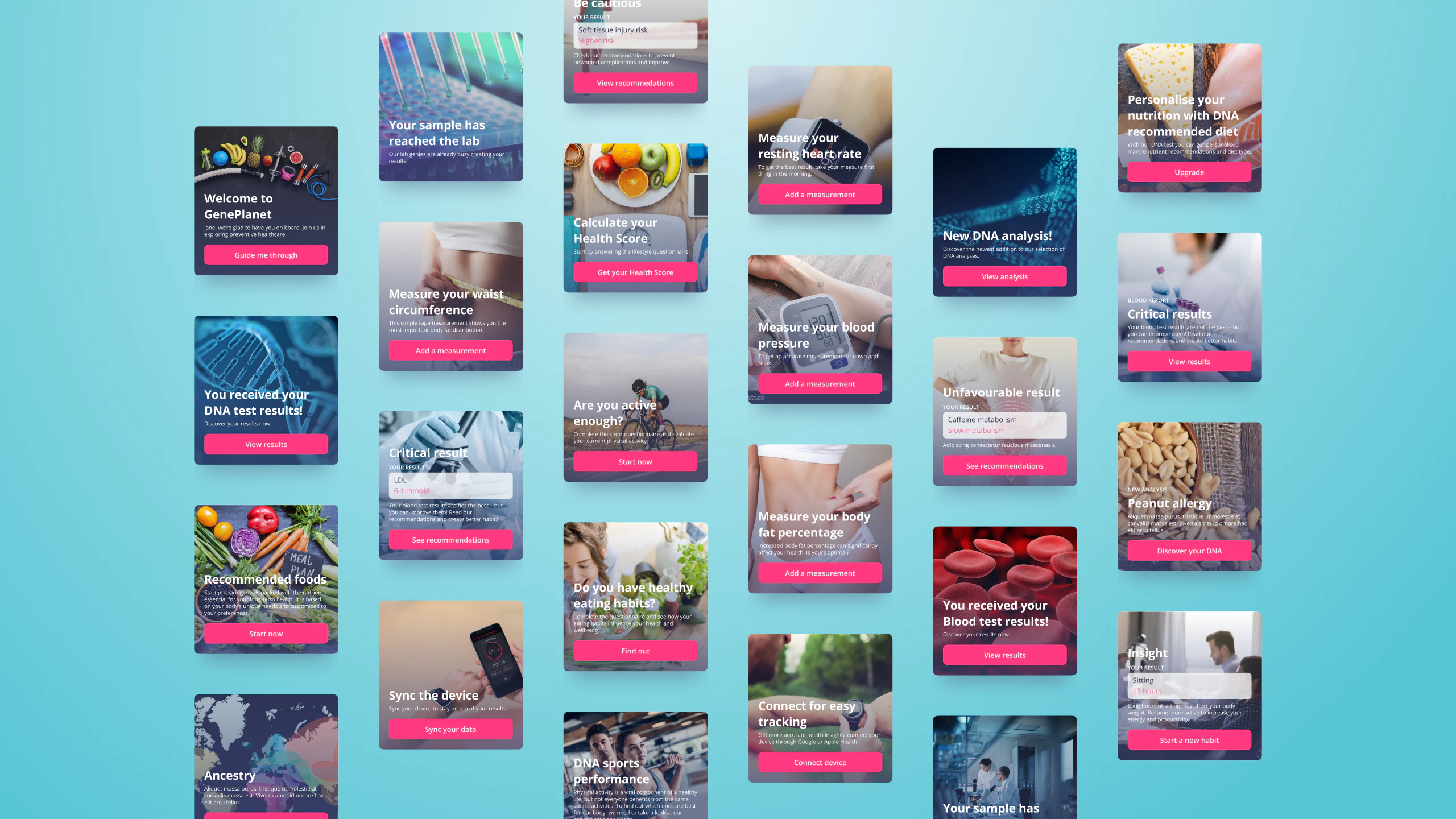
Call to action cards
One of the requests for the dashboard was to display up-to-date, relevant content. Thru this content, the company intended to inform users about the actions to take, news, product updates, such as new analyses, and many more. To communicate with the users we designed a flexible system of call to action cards.
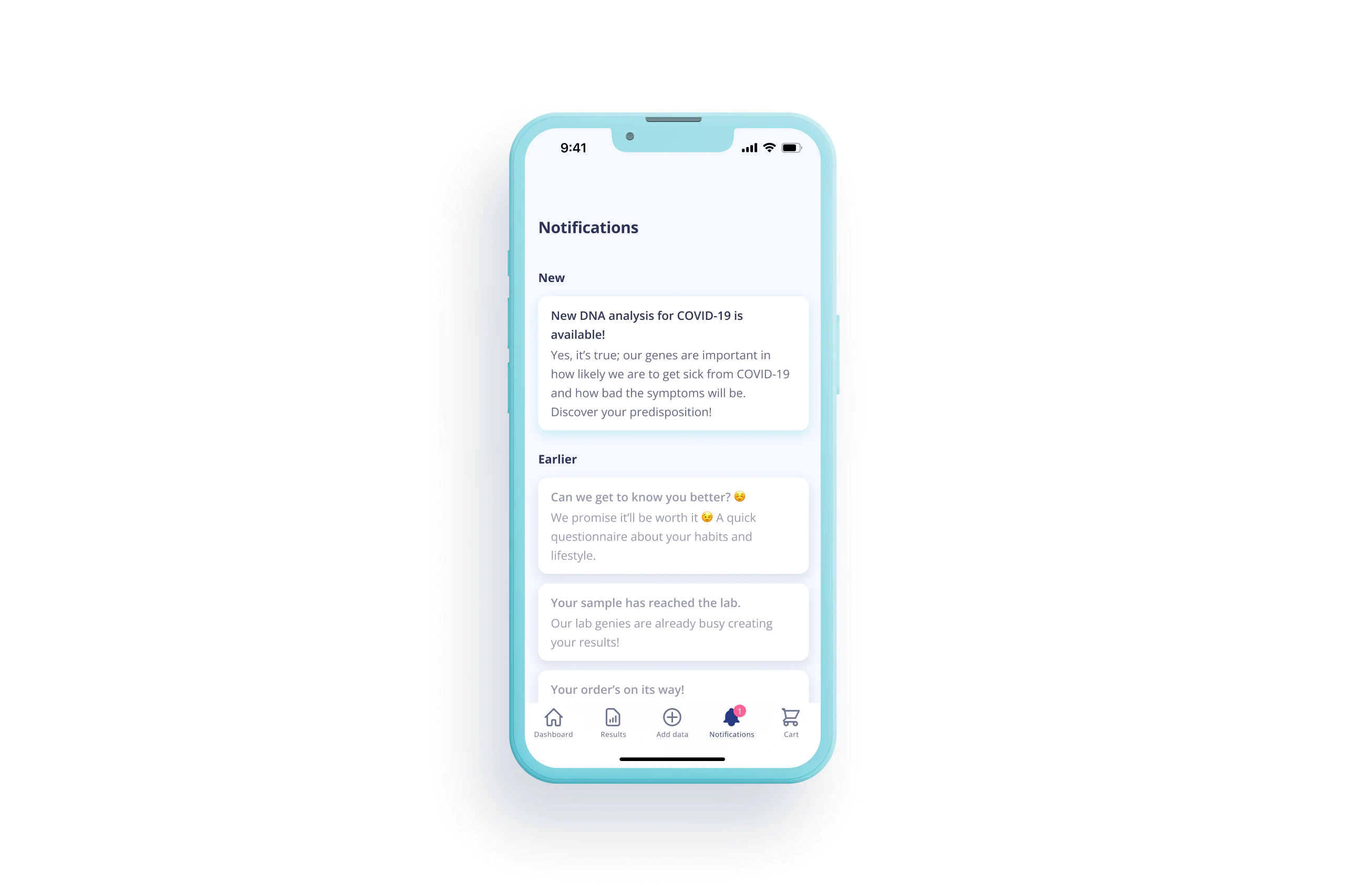
In-app notifications
As mentioned before the company’s goal was to create means to communicate inside the app. This was meant as an alternative when users opted out of the push notifications. We designed a notification feed to list incoming messages and allow users to return to useful links and information in stored read messages.
Results overview
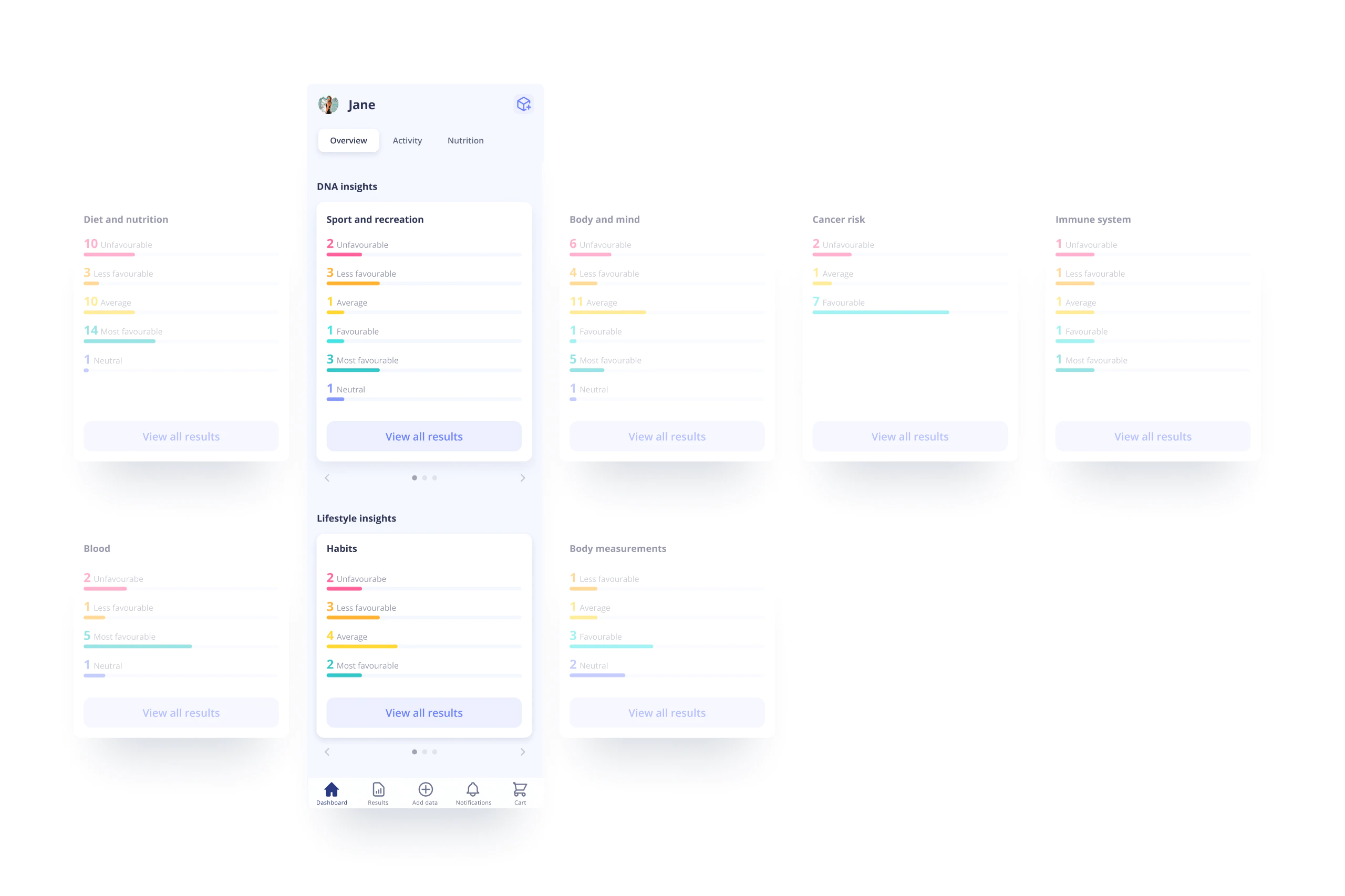
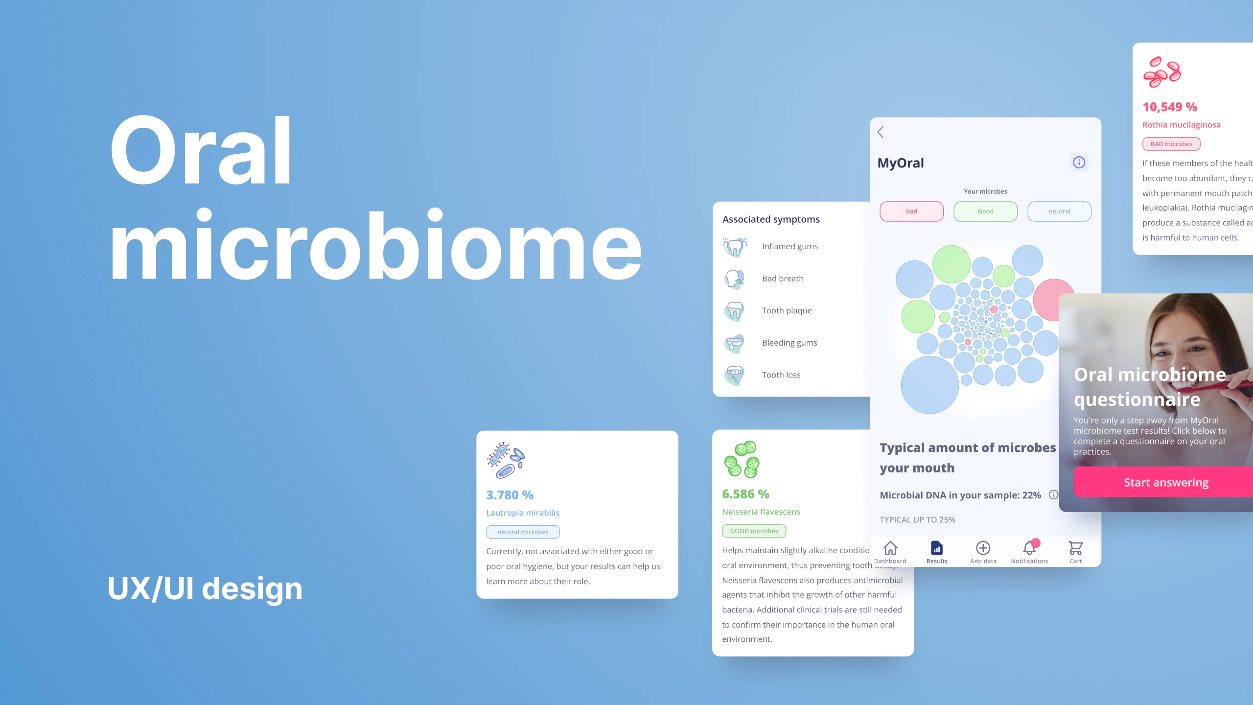
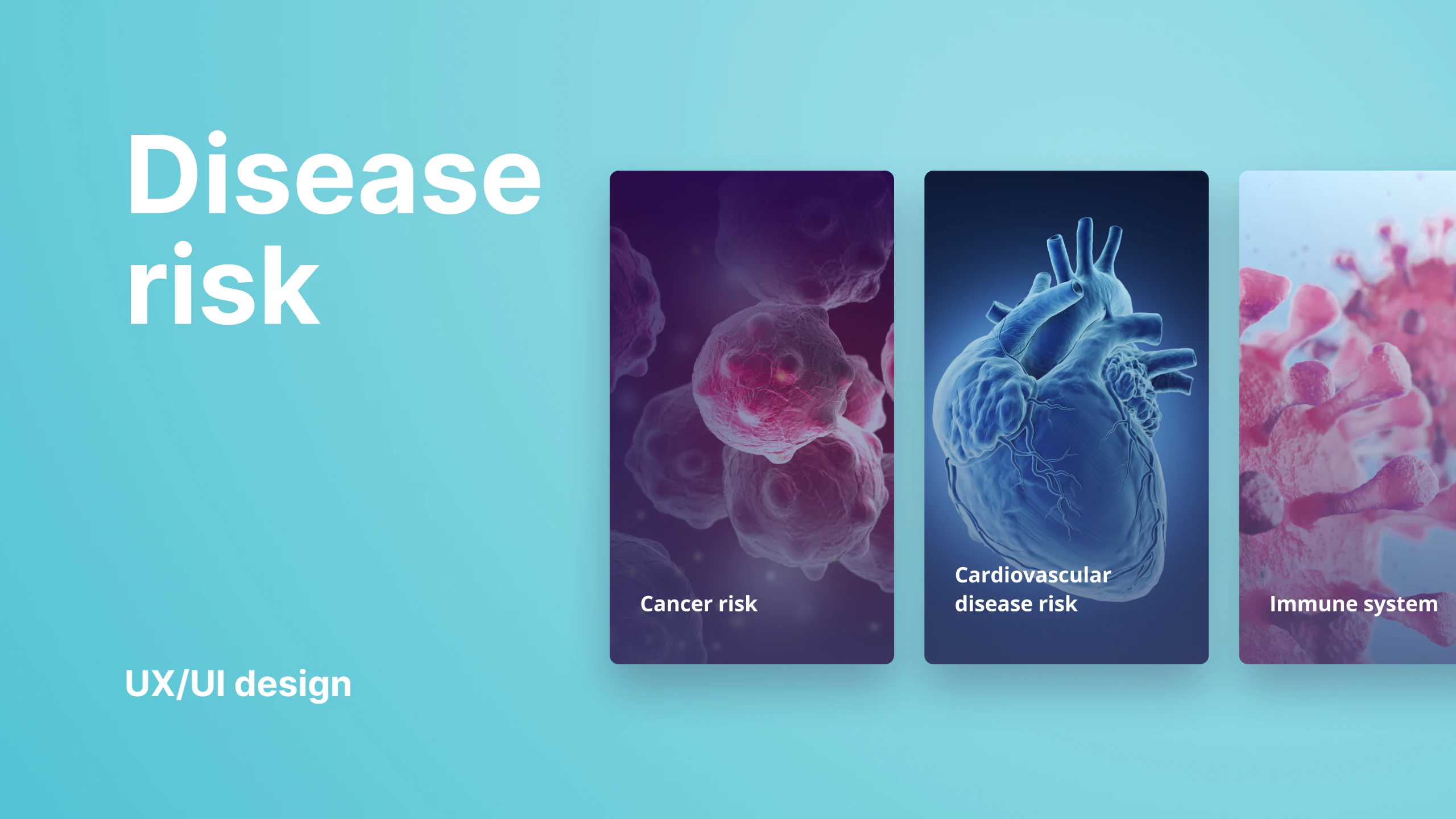
The platform stores and interprets different types of results, from DNA, blood, body measurements, habits, and more. Each of them can contain a great number of results and has its dedicated main page where users can find their reports. We had to come up with a slick comprehensive results summary for each type of result for the dashboard.
Designing for mobile and desktop
The project required to design of the dashboard’s mobile and desktop versions, where little or no content should be omitted in either version. We created a responsive design for multiple breakpoints to ensure optimal user experience on every viewport.
